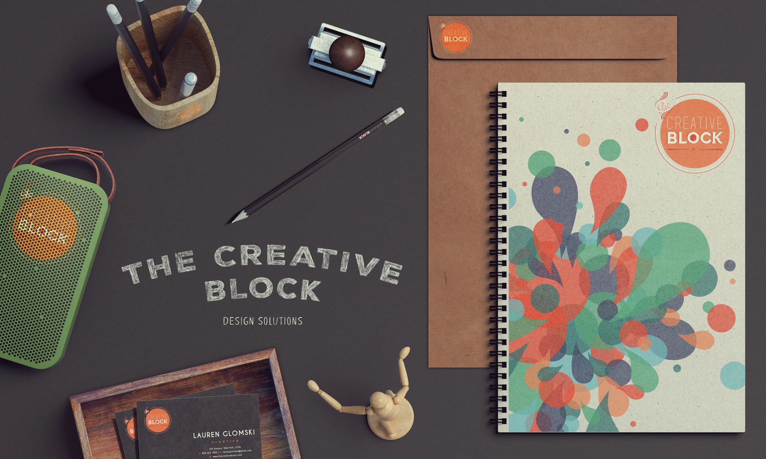
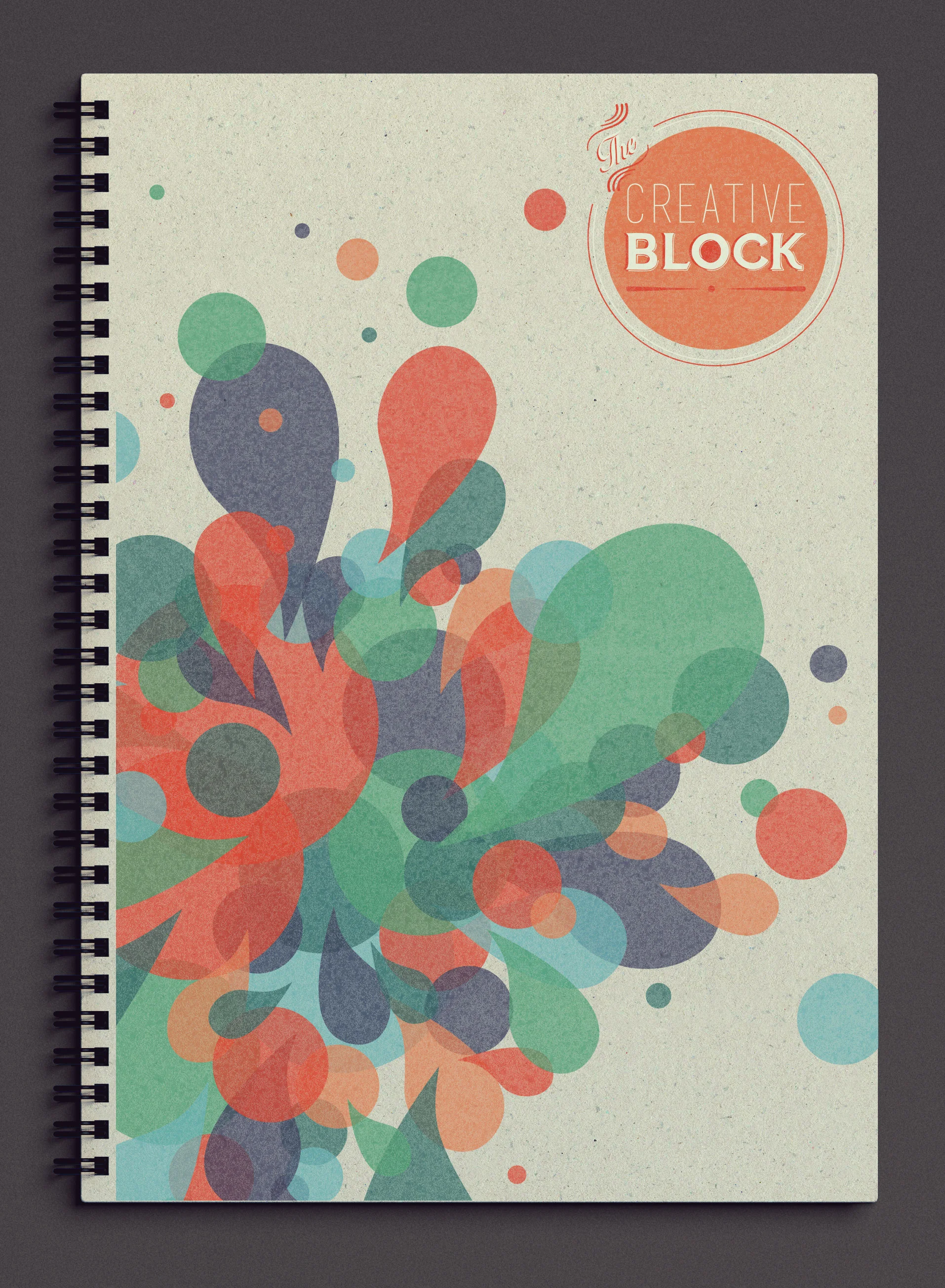
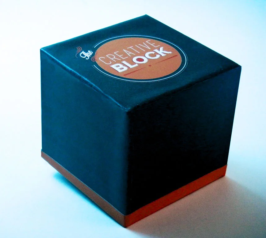
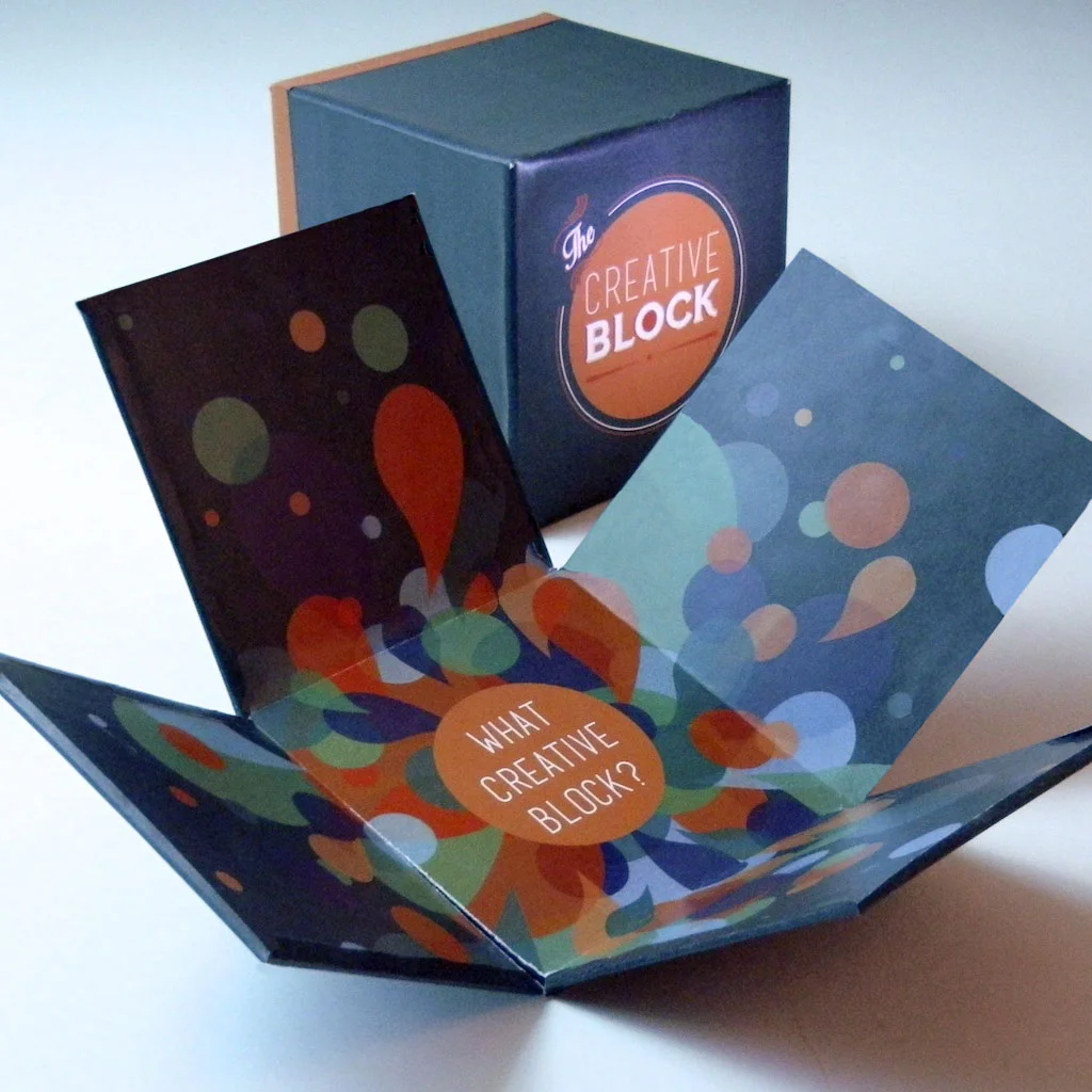
This project was originally designed to create a package for something intangible or that does not exist. I reworked The Creative Block to be a branding based project, with emphasis on the logo.
The Creative Block is a packaging design intended for young, working creatives and professionals to have a tactile "block" to work with, when their mind is lacking creative juices and they encounter a creative block.
The idea behind the mundane and blasé outside of the box, versus the colorful and exciting inside design is to portray a creative block and then once the box of “creativity” is opened up, ideas will poor into the target market's brains. Furthermore, not only does the experience of opening up The Creative Block help stimulate the brain and other muscles, but it also insinuates "thinking outside of the box".
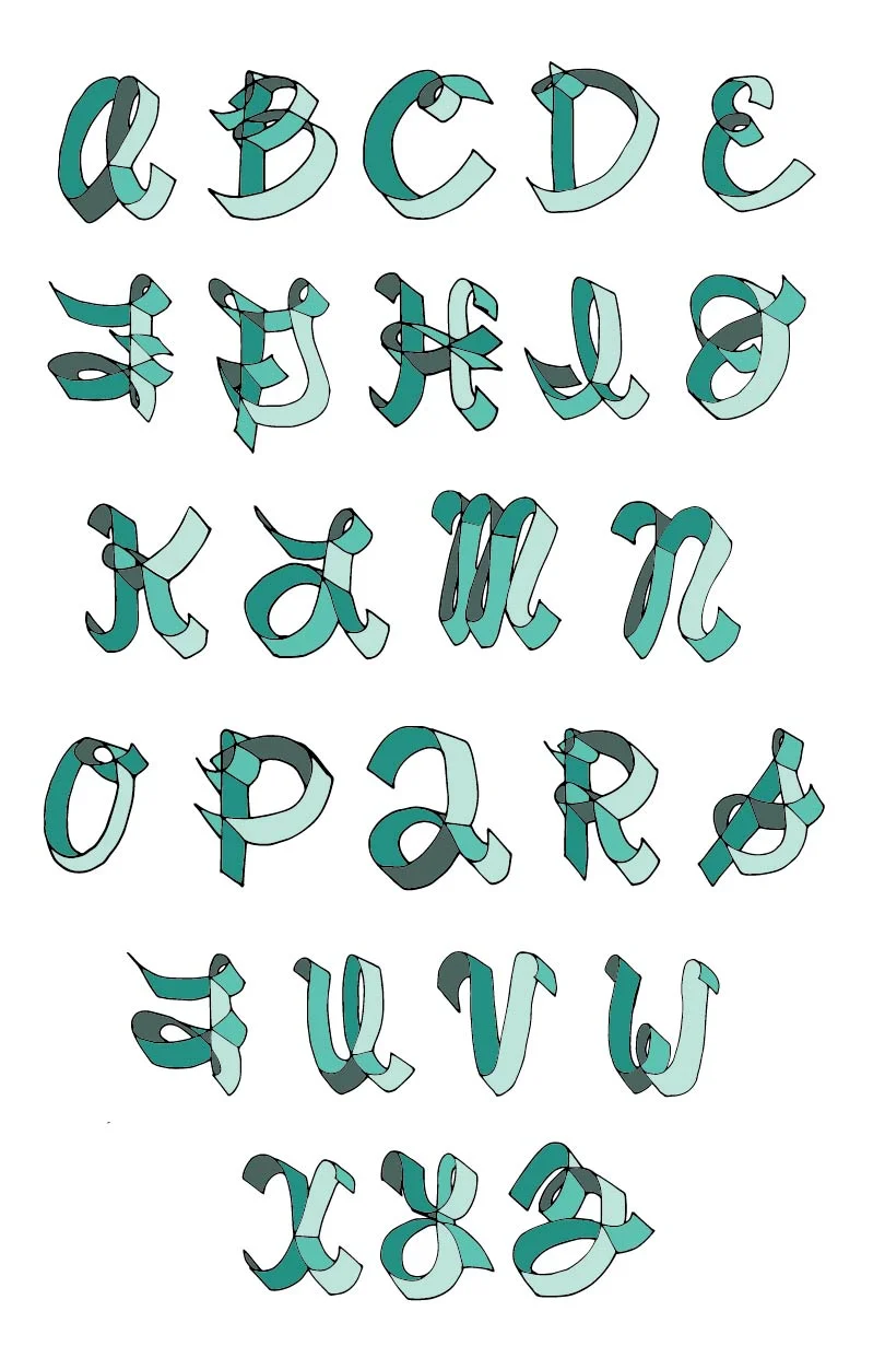
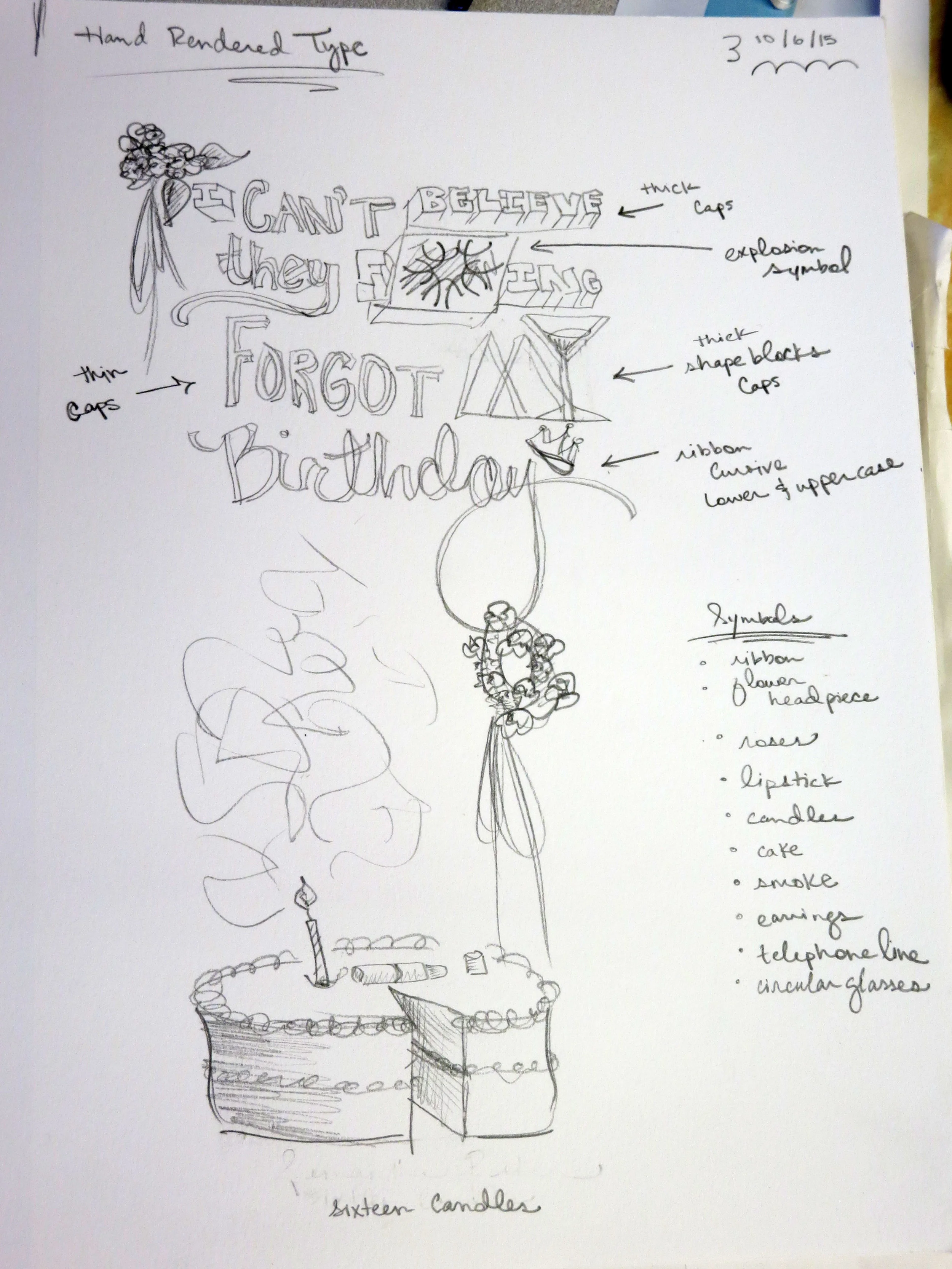
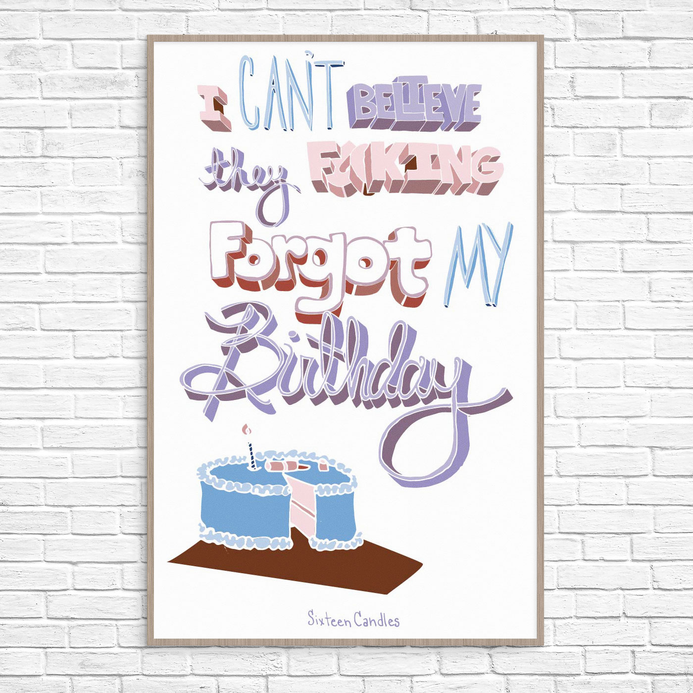
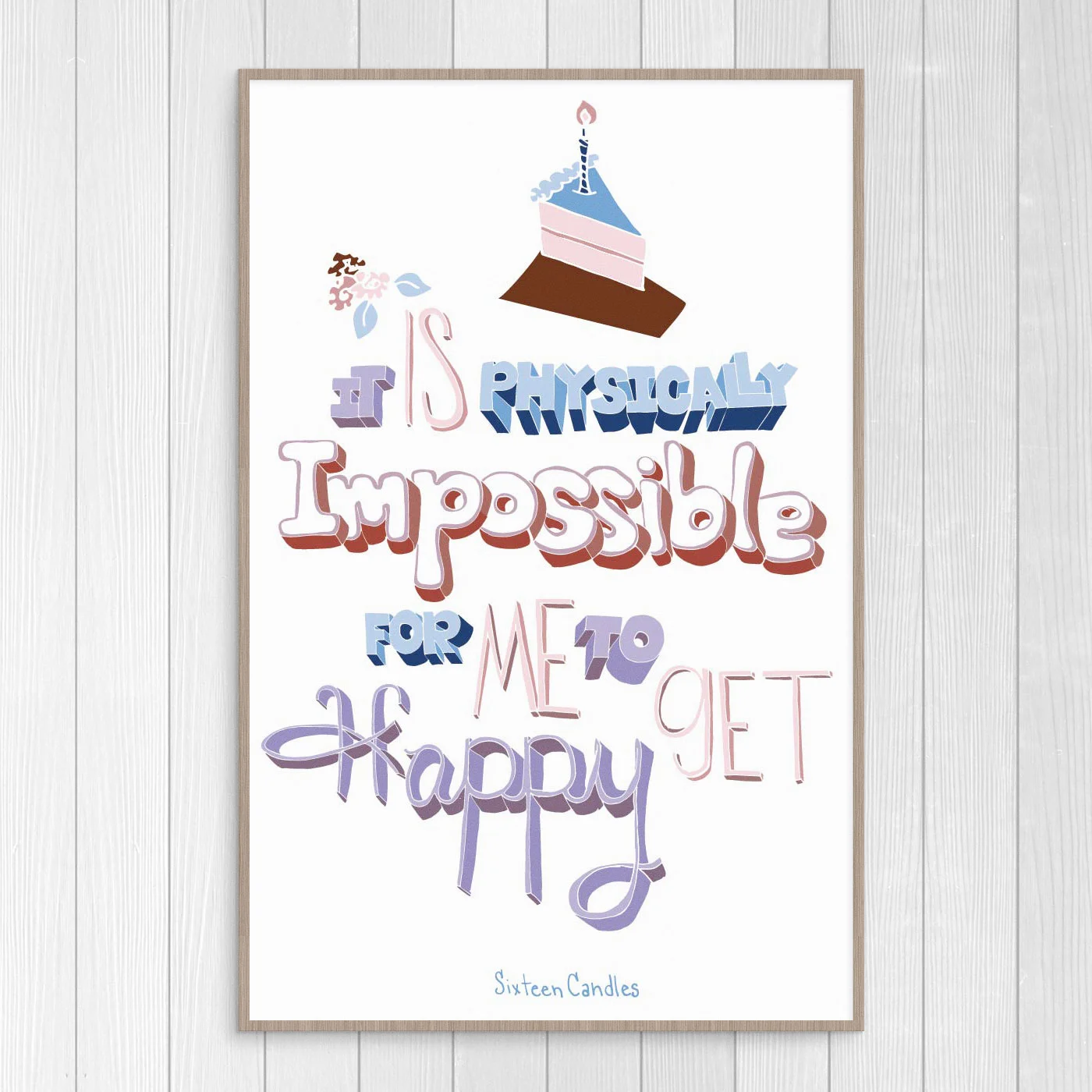
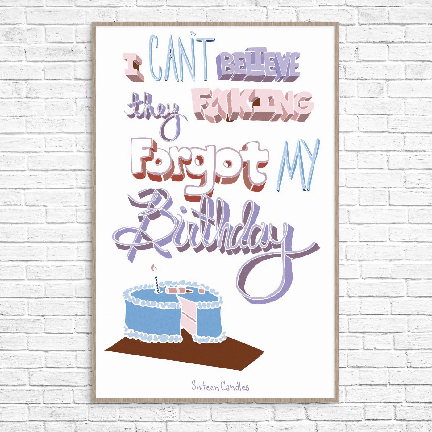
A hand rendered typography project to design a 3-Dimensional alphabet, in addition to posters or other such formats. I designed 2-3 additional 3-D typefaces to the original ribbon typography I created, and combined them together for the "16 Candles" movie quotes.
The duo 16 Candles posters are intended to be fun for younger audiences, in addition to nostalgic parents that lived through the '80's. These posters are sassy and bold, much like the character Samantha Baker, who plays the main character in 16 Candles.
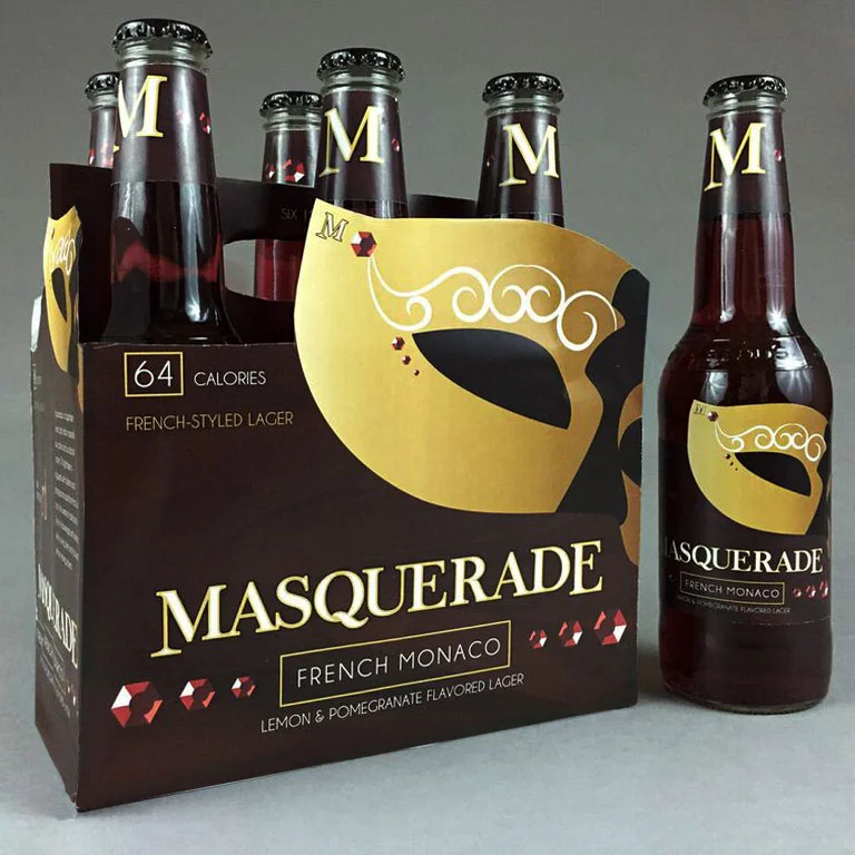
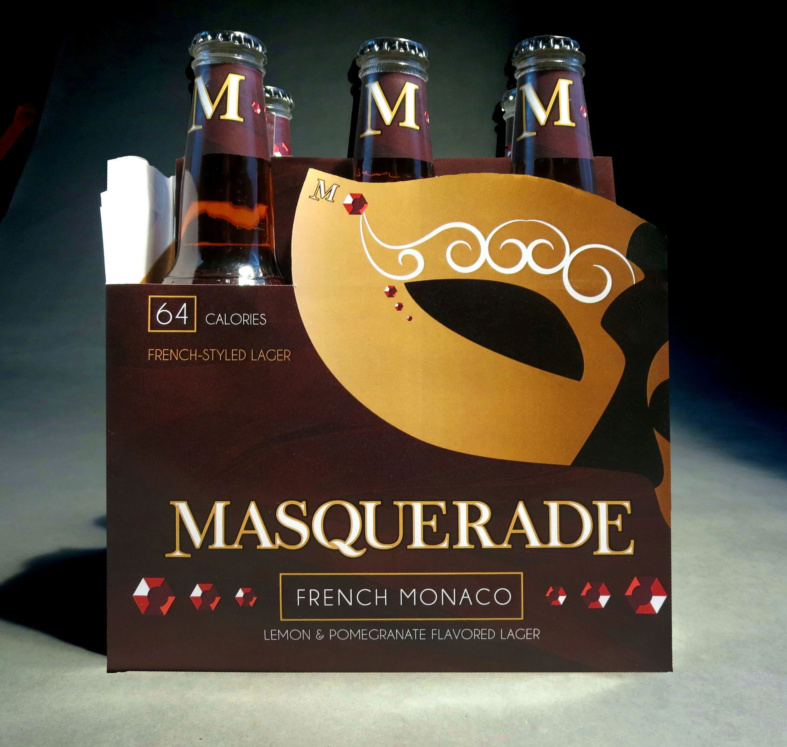
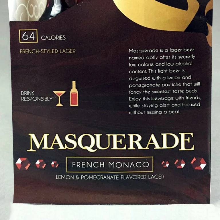
A packaging project to create a beverage for young adults and design the logo, bottle and packaging. Masquerade French Monaco is a low-alcoholic and low-calorie lager beer, specified towards young women looking for a flavorful beer without that "beer" taste.
This design is very sophisticated and classy, yet mysterious and flirty. Intended for young women looking to share a toast with their friends, while enjoying a delicious, fruity beverage.
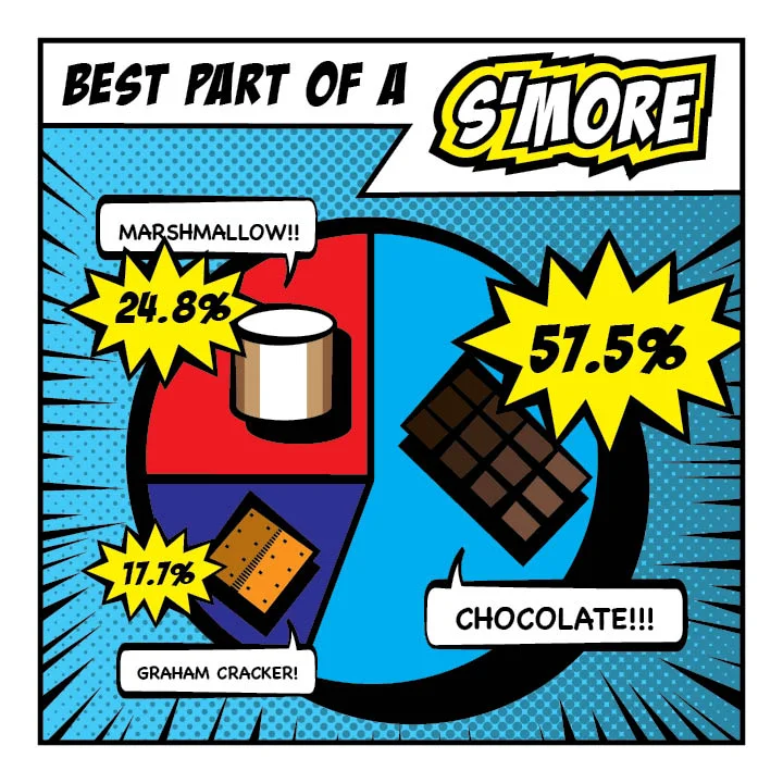
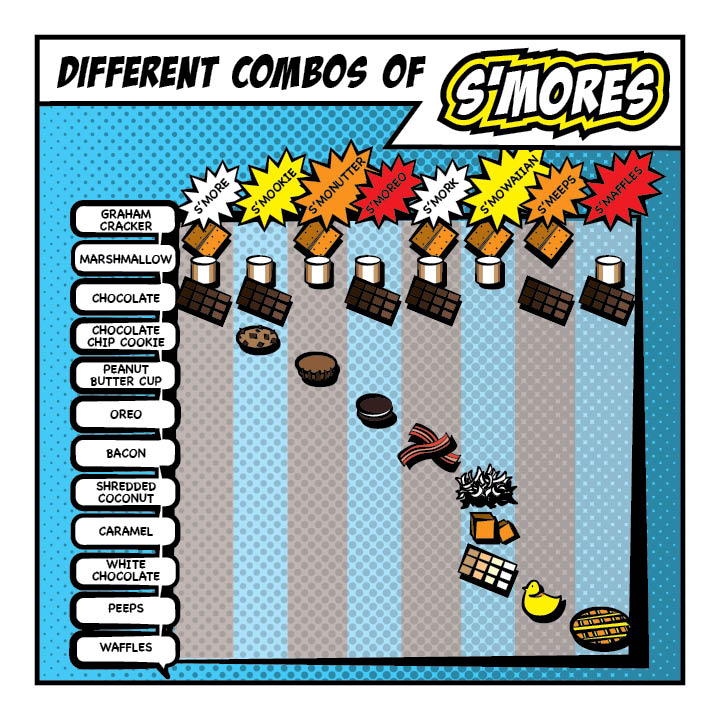
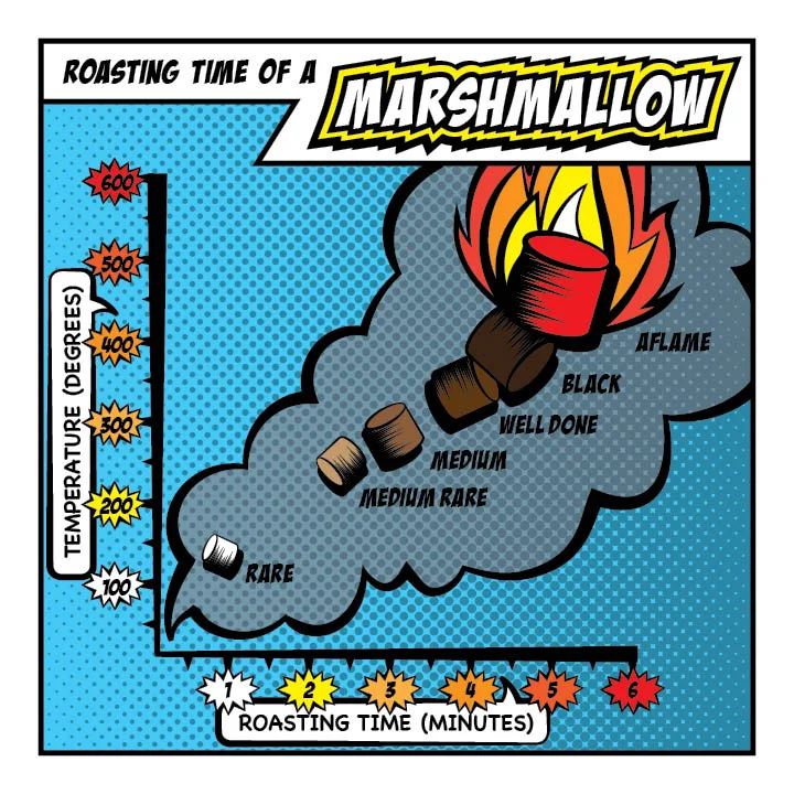
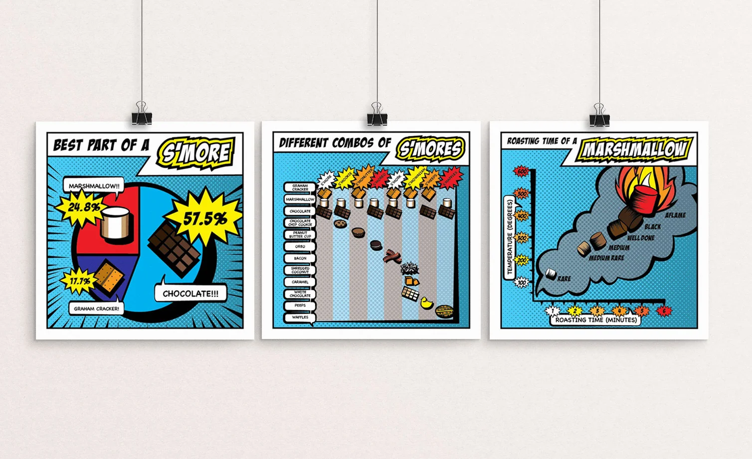
An infographic project designed to incorporate three different styles of graphs and charts in a series to inform the target audience of a given topic.
My topic is fun facts about s'mores, specified for young children and preteens, as well as their parental units. I utilized different graphs, including fever graph, pie chart, and a table to display different information about s'mores.
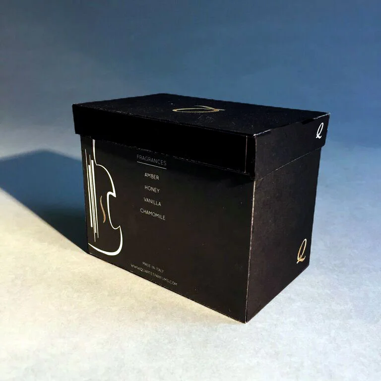
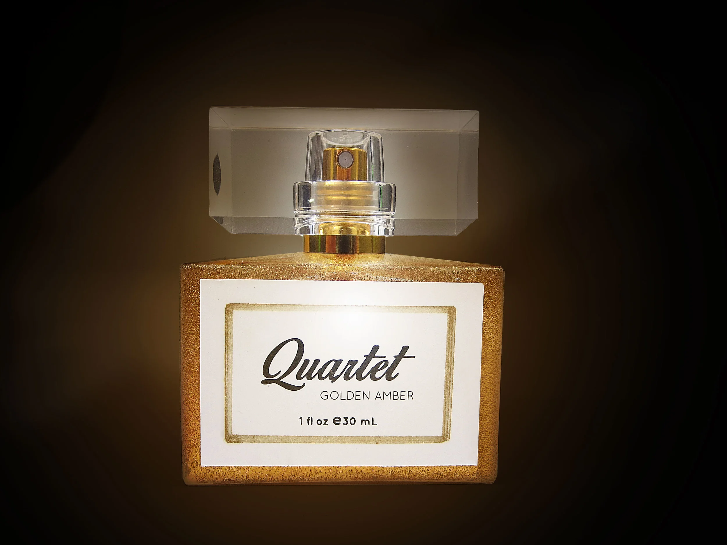
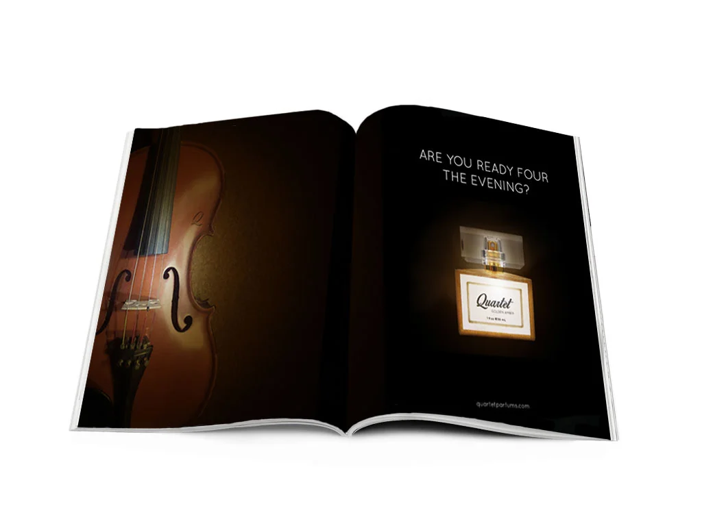
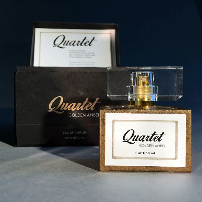
A project designed to create a logo, branding scheme, and packaging for a perfume/cologne bottle. In addition to the packaging, I designed a magazine advertisement displaying the perfume.
Quartet Perfume is classy, elegant and expensive fragrance designed for middle-aged women and empty-nesters. This perfume is meant to have a suave and sensual era about it. The theme I chose was wooden instruments, because a woman's figure and natural curves can be compared to that of the body of a violin. I based details of the packaging and advertisement around the 4-string instrumental theme, and push the definition of "quartet", which is the musical term for 4 musicians playing instruments in unison.
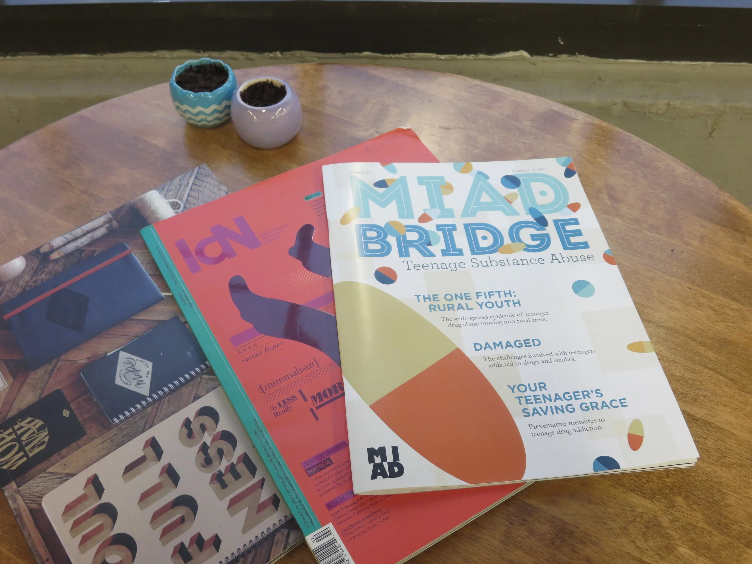
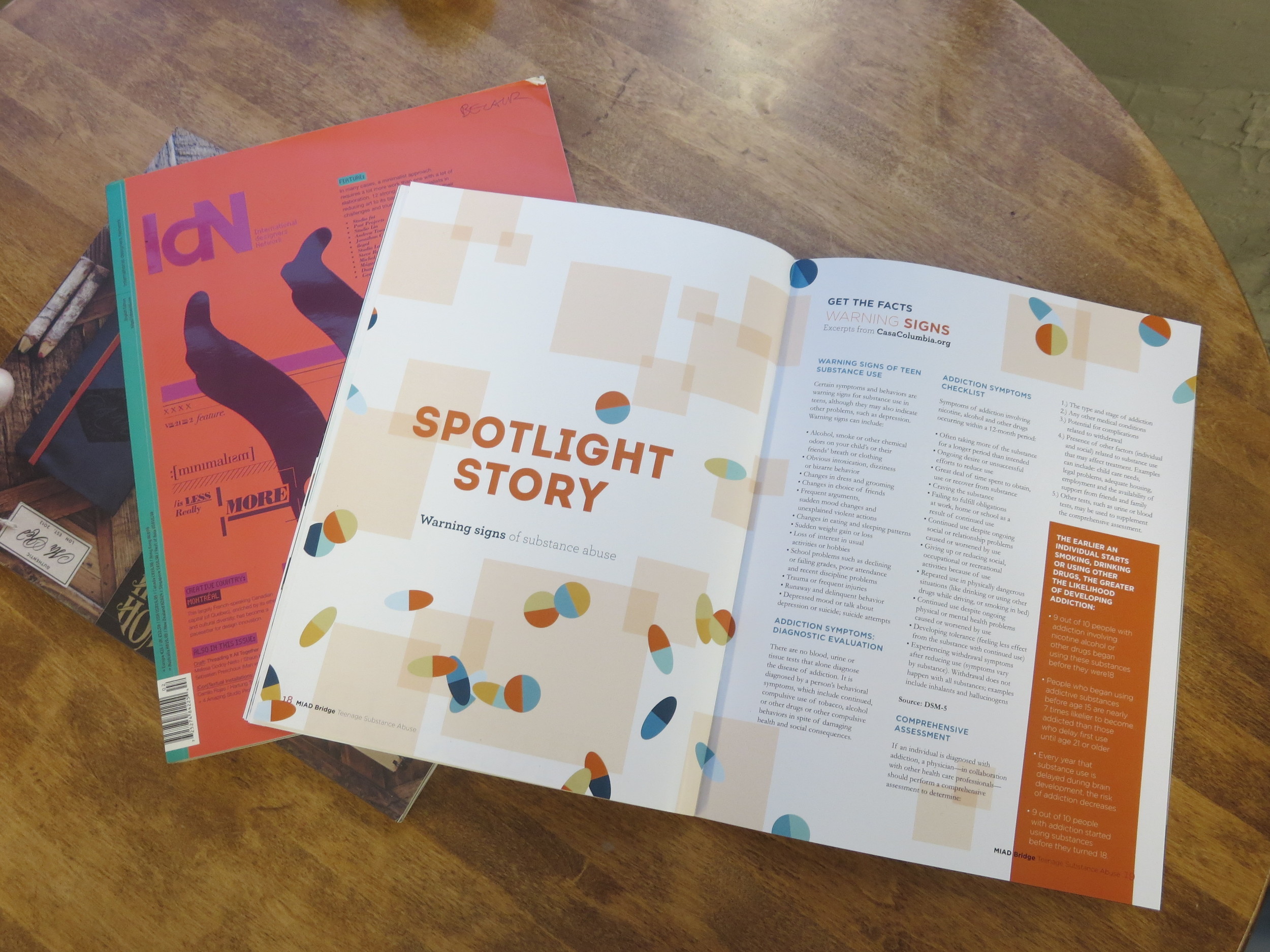
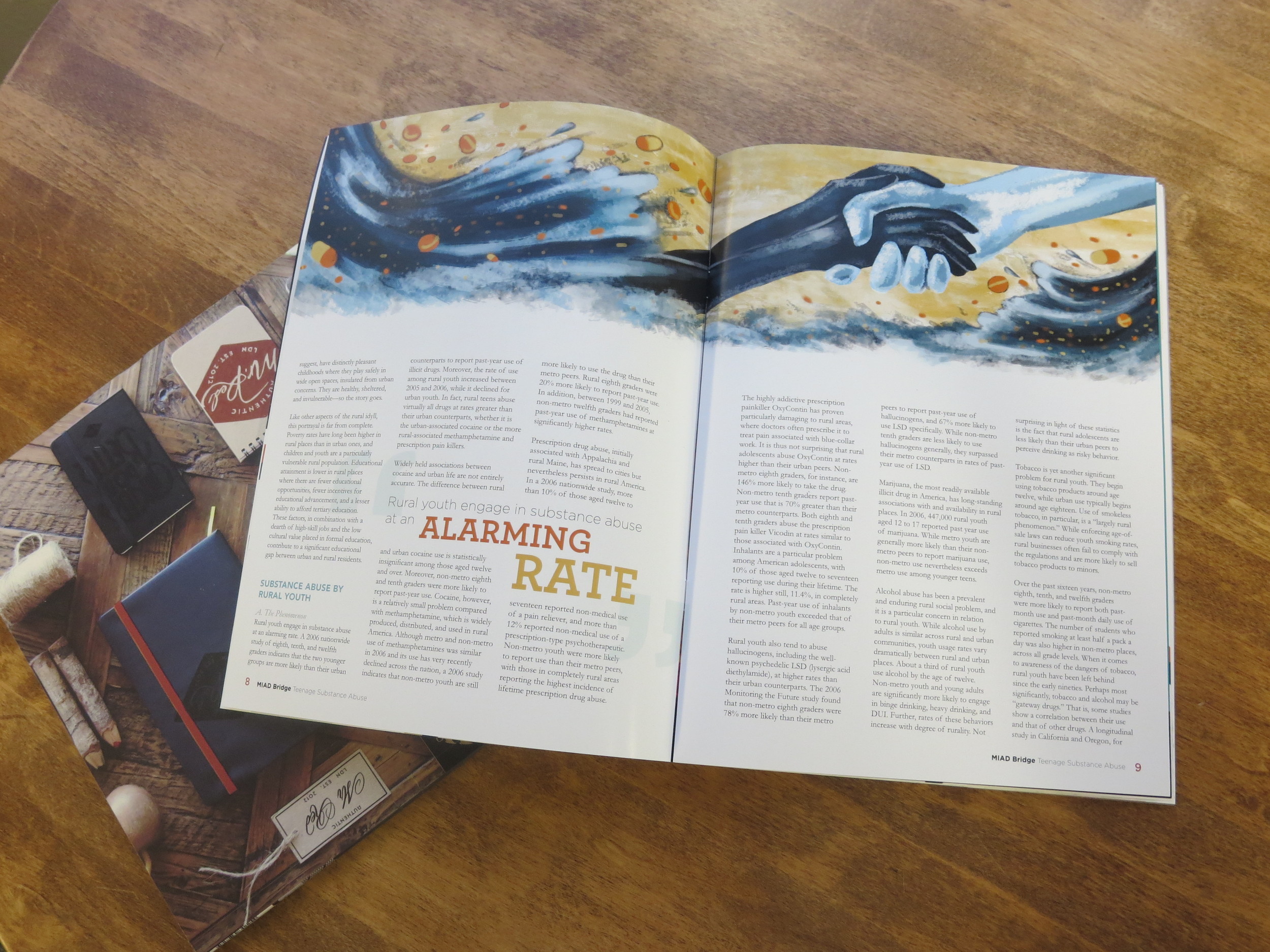
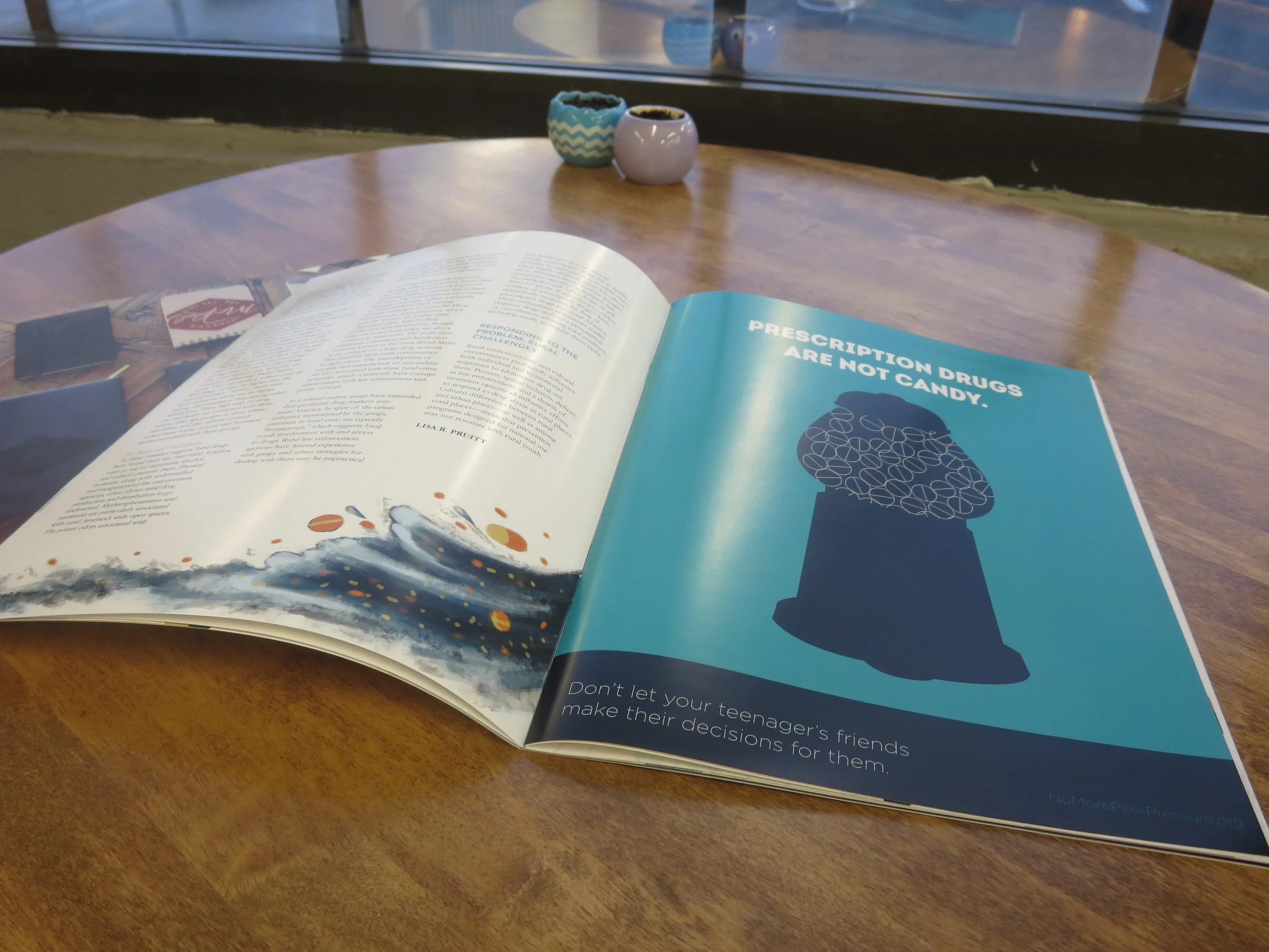
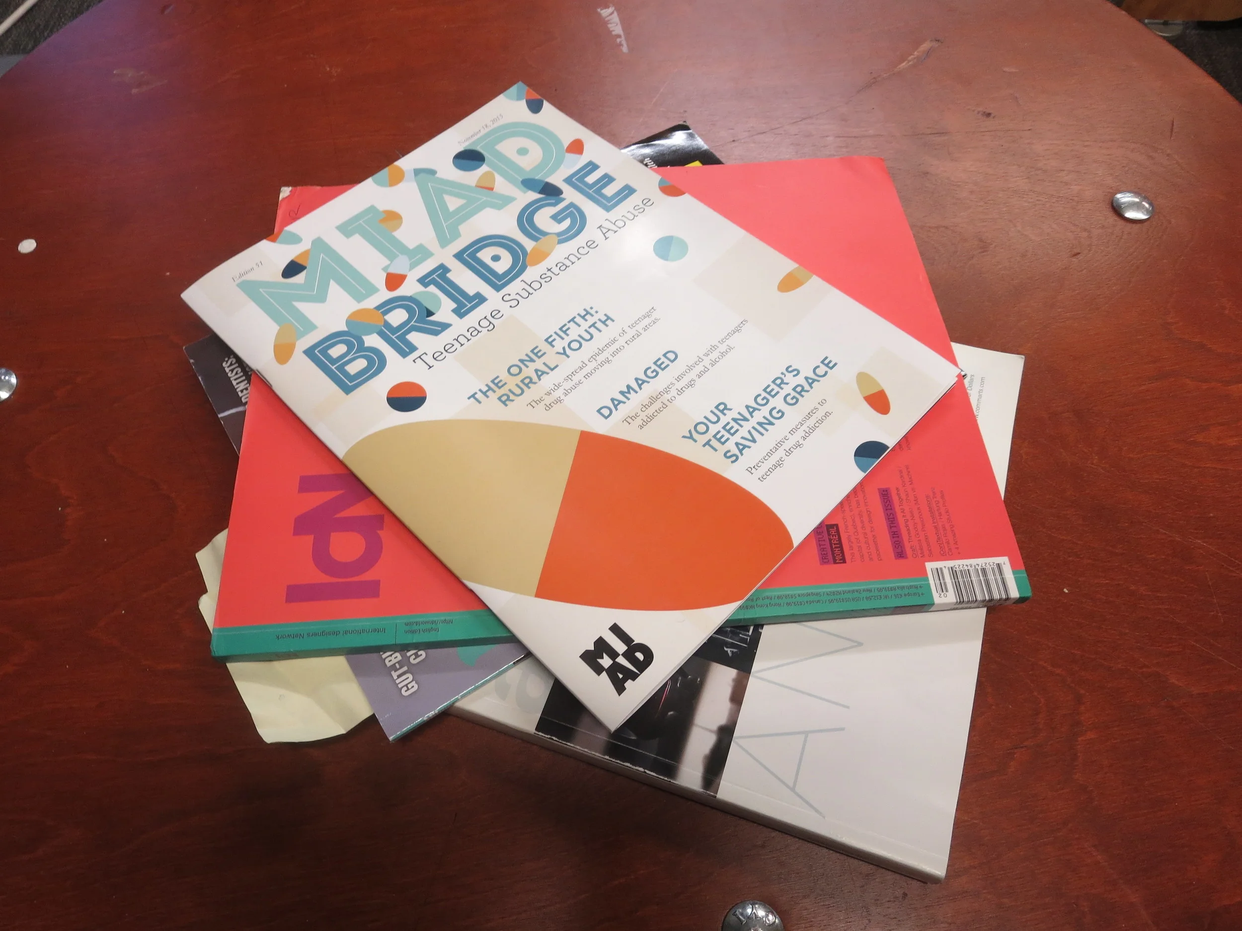
MIAD Bridge 2015 is a magazine designed to convey a message in relation to a service learning topic written about by prior students. I honed in a an article discussing the affects of teenage drug addictions, and how that affects teenager's lives, bodies, and choices.
The intention was for my target audience (middle-aged mothers and educators) to feel a sense of knowledge, relief, support, and empathy through the ultimate solution of this magazine. I wanted inform these mothers and teachers of the current situation with substance usage amongst teenagers and drug abuse within their very own communities. Furthermore, I wanted to help them prevent substance abuse amongst their students and teenagers. Also, this magazine will help my demographic clarify the facts from rumors, in addition to giving statistics and true accounts that they may be able to relate to. Overall, this magazine was created as a true source of knowledge, in order to give these parents and educators a sense of understanding and support to know they are not alone.